2015 Pantone Color of the Year!
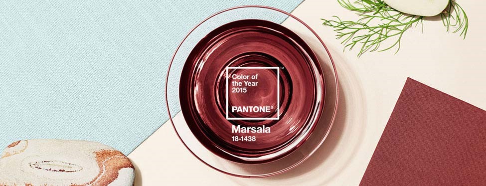
Planning your projects for 2015? Look for Marsala, the Pantone 2015 Color of the Year, incorporated into designs and styles in stores. Read about what this rich, warm color evokes and how it was selected. Click the link below to read the article.
http://www.pantone.com/pages/index.aspx?pg=21163&
According to the experts at Pantone…
“Much like the fortified wine that gives Marsala its name, this tasteful hue embodies the satisfying richness of a fulfilling meal while its grounding red-brown roots emanate a sophisticated, natural earthiness. This hearty, yet stylish tone is universally appealing and translates easily to fashion, beauty, industrial design, home furnishings and interiors.”
MARSALA COLOR PAIRINGS
Whether in a flat or textured material, or with a matte or gloss finish, this highly varietal shade combines dramatically with neutrals, including warmer taupes and grays. Because of its burnished undertones, sultry Marsala is highly compatible with amber, umber and golden yellows, greens in both turquoise and teal, and blues in the more vibrant range.
Don’t be afraid to use complimentary or contrasting colors! Experiement and see what feels right to your eye.

